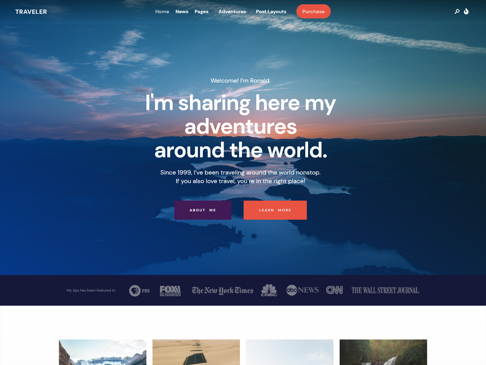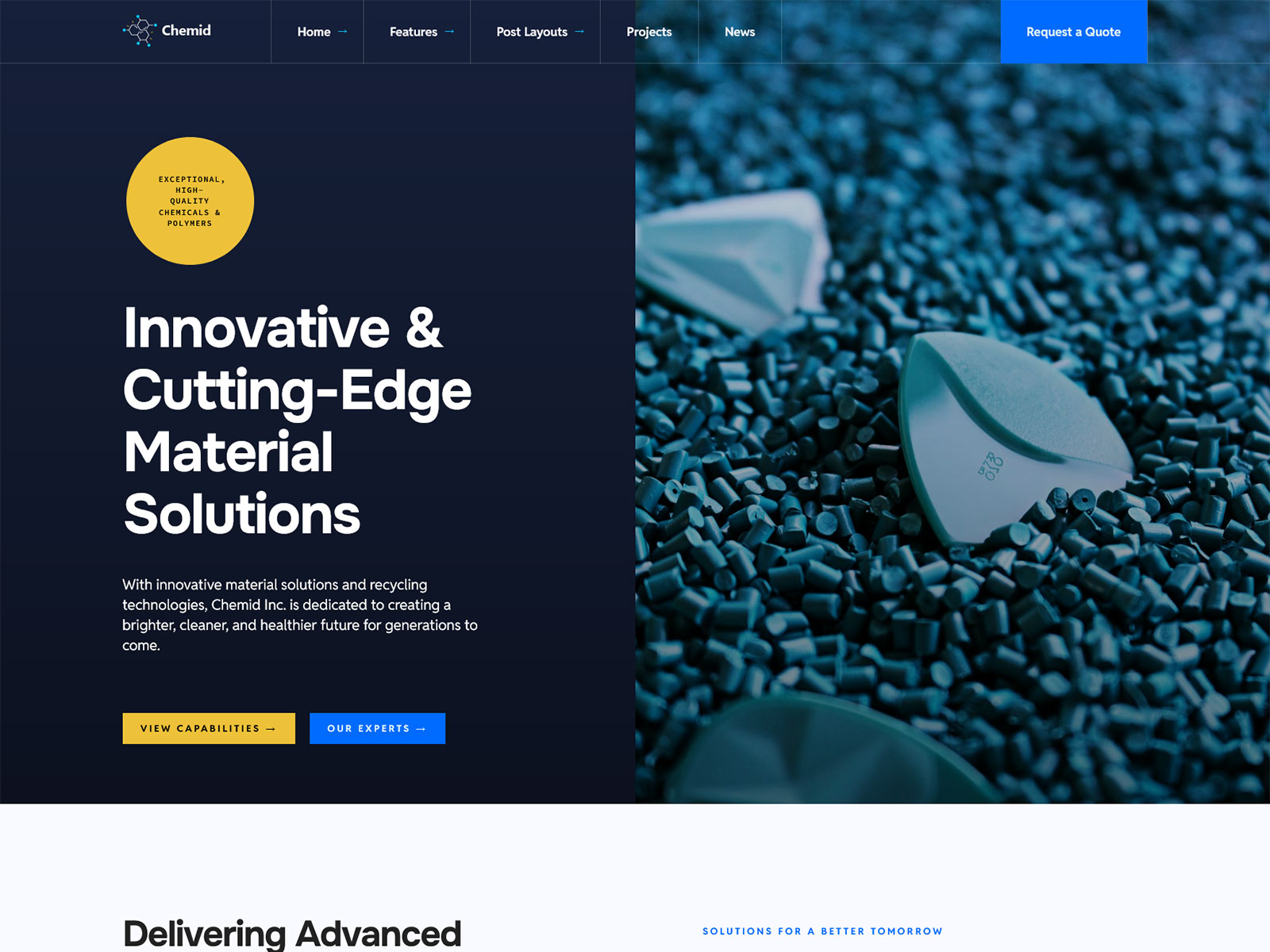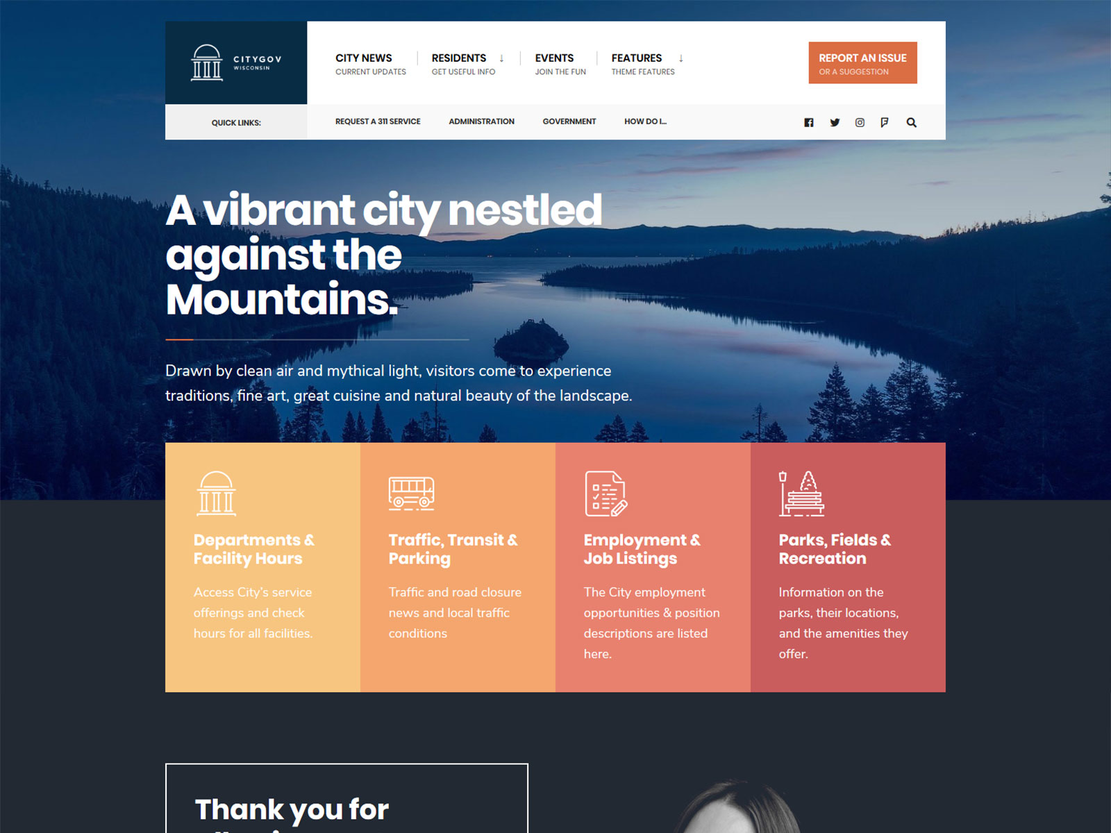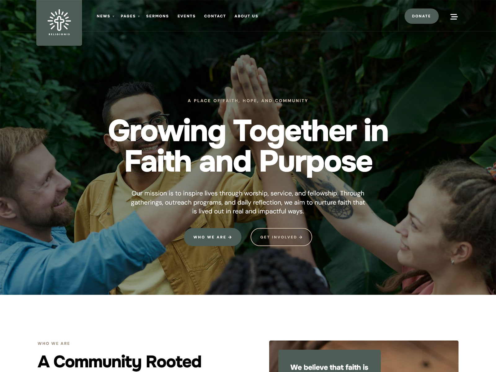


If you’ve spent any time browsing new websites lately, you’ve probably noticed a pattern: a centered headline, two buttons, a gradient blob floating behind a 3D illustration, a grid of icon cards below. It’s not that any single site looks bad. It’s that dozens of them look identical. That sameness has a name now, and it’s making people anxious about their own sites blending into the noise.
This isn’t an anti-AI article. AI tools are genuinely useful for scaffolding a layout or generating a first draft. (BTW: I’m using AI on daily basis!) The problem isn’t the tool, it’s what happens when nobody makes a decision after the tool runs. A theme (or a site) starts to look “AI-generic” when every choice is left at its default: default spacing, default color pairing, default hero pattern, default icon set. Authenticity, in a design sense, isn’t a vibe, it’s evidence that a human made specific, non-default decisions on purpose.
If you’re a non-technical site owner picking a WordPress theme, you don’t need to become a designer to avoid the generic look. You need to know what to look for. Here are five concrete signals you can check on a theme’s own demo, not marketing language meant to convince you a theme is well-made.
Disclosure: I design and sell WordPress themes through Themnific and Dannci. I have an obvious interest in this topic, so judge the advice below on whether it’s specific and checkable, not on my say-so.
1. The layout isn’t built entirely on a centered, evenly-spaced grid
The fastest tell of a default template is symmetry everywhere: hero text dead-center, three feature cards in identical boxes with identical padding, a testimonial row with the same card repeated. Real design intent usually shows up as intentional asymmetry. That can mean a hero where the text block is offset and slightly larger than the supporting image, a features section where one item is visually emphasized instead of all three getting equal weight, or spacing that varies on purpose rather than sticking to one repeated unit.
What to check before buying a theme: Look at the demo’s section-to-section rhythm. If every section uses the same padding, same column count, and same card shape, that’s a strong sign nothing was customized past the defaults, whether or not AI was involved in the build.
2. Typography has a pairing, not just a system font
Most page builders and starter themes ship with a single sans-serif (often something in the Inter/Helvetica-adjacent family) used for everything: headlines, body copy, buttons, labels. It’s not a bad font. It’s just the font everyone leaves in place because changing it takes effort.
A theme with real design intent usually pairs two typefaces with a clear job split. One is a distinctive display face for headlines (something with actual character: a serif, a slab, a font with unusual proportions), and the other is a quiet, legible face for body text. The pairing should also show up as a deliberate scale, with headline sizes that jump meaningfully rather than a flat, timid hierarchy where everything is within a few pixels of everything else.
What to check: Look at the demo’s H1 versus body text. If they’re the same font family at different weights, that’s the default path. If they’re two different typefaces working together, someone made a choice.
3. Color has a rationale beyond a gradient generator
Purple-to-blue gradients, a single accent color dropped onto an otherwise black-and-white layout, and decorative blobs in the background come from the same handful of default palettes that ship with nearly every AI website generator and no-code builder. They’re not wrong. They’re just everywhere, which is exactly why they don’t read as intentional.
A theme with an intentional palette usually has more than one accent color with a clear role for each: one for primary actions, one for highlights or tags, a distinct neutral scale for backgrounds and borders. The colors also tend to relate to the theme’s actual subject matter. A restaurant theme leans on warm, appetite-driven tones. A legal or municipal theme uses restrained, authoritative color. A portfolio theme can afford higher-contrast, more saturated choices because the audience expects personality.
What to check: Count the colors doing real work in the demo. If it’s one accent color plus a gradient, that’s a default. If there’s a small, coherent system where you could explain why each color exists, that’s intent.
4. Imagery and icons aren’t the same stock set everyone else uses
Generic 3D illustrations of floating laptops and abstract geometric blobs, or icon sets pulled straight from the most popular free icon library without modification, are the visual equivalent of a font nobody changed. They’re fine as placeholders. They’re a problem as a finished product, because thousands of other sites are using the exact same assets.
Authentic themes tend to do one of two things. They use real, specific photography relevant to the niche, not generic “team high-fiving in an office” stock. Or they commit to a custom or heavily modified icon and illustration style with a consistent stroke weight, color treatment, and level of detail across the whole set, not a mix of three different icon styles pulled from different free packs.
What to check: Look closely at the icon set across multiple pages of the demo. Mismatched stroke widths or inconsistent corner styles usually mean the icons were never unified, a sign of a build that stopped at “good enough.”
5. The details that don’t get demoed are still finished
This is the hardest one to check but the most reliable: default-heavy themes usually look fine on the homepage and fall apart everywhere else. Look at the 404 page, the search results page, form field states (focus, error, disabled), and empty states like an archive page with no posts. These are the pages nobody screenshots for the marketing demo, so they’re where corners get cut.
A theme that’s been finished with intent treats these secondary states with the same care as the homepage. That means a styled 404 instead of the raw WordPress default, form fields with a visible focus state instead of the browser’s default blue outline, and consistent spacing on the blog archive even when there’s only one post in it.
What to check: Before buying, click through to a demo’s blog page, a single post, and (if you can) trigger a 404 by mistyping a URL. If those pages look like an afterthought, the polish you saw on the homepage was surface-level.
The actual test
None of this requires design training to evaluate. It requires looking past the homepage hero and checking whether decisions were made consistently, all the way down. A theme built with intent will hold up under that kind of scrutiny. A theme running on defaults will start looking the same as everything else the moment you look past the first screenshot.
If you’re evaluating a theme right now, pull up its live demo and run it through these five checks before you buy. It takes about five minutes and will tell you more than any marketing copy on the sales page.
Dannci has been building and selling WordPress themes since 2008. He knows classic theme architecture inside out; PHP templates, the Customizer, widget areas, all of it. This article comes from the middle of his own shift to block themes: the first FSE theme he’s currently developing for Themnific. If the learning curve feels steep, he’s on it right now too.
Last modified: